

After Image Before Image
The almost-famous ABFriday Forum begins the year 2015 with a special new feature, entitled “One Photo Focus.” Here’s how it works: one week each month, all participants will impose their skills and if need be, their trickery on the same image. The images for the next several months have already been submitted by the early adopters who have already signed up for this extravaganza. The honor of being the first in 2015 goes to Emilio Pasquale and he has presented us with an interesting challenge. I thought at first it was taken on the set for the chicken race scene in the movie “Rebel Without a Cause.” I can’t wait to see what other interpretations will be unveiled today which can be found here. Like all ABFriday posts, anyone can participate. Guidelines can be found at Stacy Fischer’s Visual Venturing site.

Emilio’s Original Challenge Image
Looking at the challenge image I could see (after the movie flashback) that it was quite dark (despite some strong shadows) and it lacked overall sharpness. This is not necessarily bad, but it does affect the directions one can choose in creating something that hopefully will have an impact. And I suspect that Emilio didn’t want to make it too easy. Anyway, it seemed that moving away from a photographic look toward a painterly style might be worthwhile. In doing so, I learned that there is a dark side to Photoshop CC.
But I am getting ahead of myself. The first step was to follow my normal workflow and run the original image through the RAW (ACR) process, adjusting contrast, tonality, and brightness. The result is shown in the image below which evokes a sunny day that seemed consistent with the strong shadows in the original. The adjustments (some of
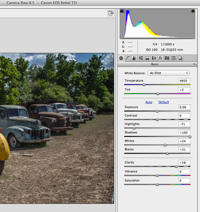
ACR Adjustments
them rather extreme) were intended to cut back on the bright highlights and open up the dark areas for greater detail.
Step 2 was to open the image in Photoshop and after routine and very minor clean-up, the Unsharp Filter was unleashed just to see what might happen. The sharpness didn’t improve, but as the setting got more extreme, the image got more interesting (i.e., less photographic). The screen capture below shows the settings and the effect.

Unsharp Filter Applied
I’ve not done a lot of special effects work on images, but recently have been experimenting with the Filter Gallery in Photoshop. So that seemed like a good place to start and I was pleasantly surprised to find an “Oil Paint” function in the drop-down menu under Filter (Filter–>Oil Paint). What I did not know at the time was that I had accidentally opened Photoshop CS6 instead of the latest version of Photoshop CC. So be aware that the following steps are not possible unless you have a copy of Photoshop CS6 or CS5. More on this later.
Like the Filter Gallery, the Oil Paint function opens the image in a full screen dialog window with the adjustment controls on the right side. The screen capture shows the settings and a detail section of the effect.
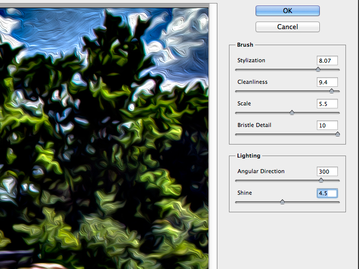
Settings for Oil Paint Filter in Photoshop CS6
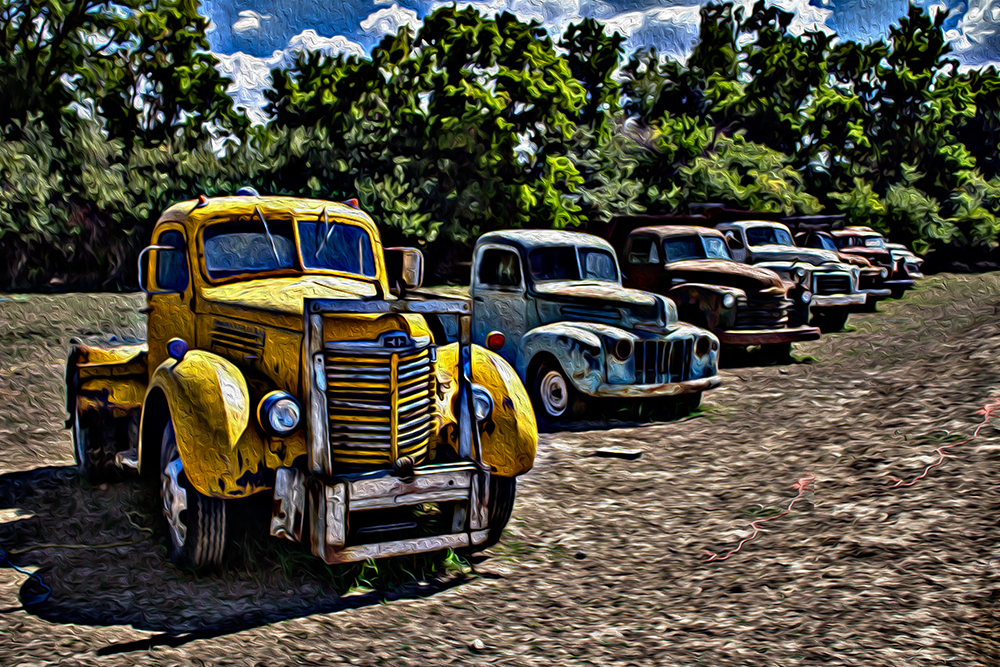
Image After Using the Oil Paint Filter
Just for fun,I took the idea one step farther, and used a black and white adjustment layer choosing the High Contrast Red Filter effect instead of the default option. The final image is shown below. Immediately below the full image is a detail of a section of the image to show a little more clearly the effects of the Oil Paint Filter. I would be interested in your thoughts on the color vs. the black and white versions.
 Final Image

Thanks again to Emilio Pasquale for his contribution to the First Edition of One Photo Focus. And thanks to Stacy Fischer for organizing this project. To see what the others have done with Emilio’s image, please check out the Visual Venturing post at this location. And if the raging online controversy over Adobe’s removal of the oil paint filter piques your interest, just Google “Where is the Oil Paint Filter in Photoshop CC?”

Pingback: ABFriday Week 31: One Photo Focus | Visual Venturing
I’m usually a glutton for color, but the old-timey (?) look of the trucks remind me of a truck my grandfather had, and, therefore, seem right in a black and white format, like photos of that time. Cool!
LikeLiked by 1 person
Thanks very much for your comments. Yes, I think the B&W does tend to hark back to those days. The color version reminded me of the 1950s (hence the reference to the movie). I was tempted to insert an image of Natalie Wood from the movie, but that would have been over the top.
LikeLike
Love what you did, and I too have been wondering where did the oil paint filter go? Will have to check that out.
LikeLike
Thanks, Mary. Yes, it was a totally accidental discovery on my part. I had done the work on the image and then saved it, came back a day or so later to document the steps for the blog, and could not find the “Oil Paint” filter. A frantic search ensued until I finally figured out that I had called up CS6 unintentionally when I opened the file the first time. I hope Adobe figures out a way to bring it back, but it has been a long time now.
LikeLike
I love your image lol….i’m lol-ing because we achieved a similar effect! Although admittedly I took a shortcut by using a filter. Nice job! Fun challenge. 🙂
LikeLike
Hi, Laura: Thanks for the comment. I just checked your interpretation and that is a bit of a coincidence. I guess the main difference is the sepia tone in yours that gives it a vintage photo appearance. I just got back in from a shoot so will go check out the others.
LikeLike
You’re welcome and thanks for the comment on mine as well. Great minds think alike!
LikeLiked by 1 person
Hi Robyn, great work, I loved the black and white image when I opened your bog, but then I saw the colour, and with the additional texture the trucks look like they come right out a 1960’s movie about drag racers. great work
LikeLiked by 1 person
Hi, Janice: Thanks! Yes the B&W and Color give quite different effects. The brush strokes are more apparent when the image gets big, so I think the idea works much better when larger (e.g., about 11 X 14).
LikeLiked by 1 person
Nice edits Robin, I like the retro 50s look of the B&W image best and I really like the tight crop on the final image.
LikeLiked by 1 person
Thanks very much Katie. The B&W seems to have the lead so far.Good of you to comment.
LikeLiked by 1 person
I like your painterly version Robin – lovely textures and I like both the BW and the colour 😉
LikeLike
Great walkthru of your process, now I have PS and have used it a bit, these now make a lot more sense to me now 🙂 I haven’t seen anyone do an oilpaint effect on a BW before so that was really unique to me. I liked how the BW seemed quite contrasty so the swirly effect was more obvious, the colour one was nice but there is something special about the BW oilpaint version 🙂
LikeLike
For me the black and white trumps the colour version in my opinion. The colour feels muddy which you would expect from the oil filter. Possibly if you added a paper or canvas texture the colour version might work. With Black and white the image has slight surreal feeling which gives an added dimension to the trucks.
LikeLike
My problem is always the sharpness of my images. I believe it is due to the kit lens that I purchased with the camera in 2010. I think it’s time for an upgrade! Anyway, I like what you did with the image but I think I prefer the color version with the painterly effect. I don’t think it muddies it up at all, which is what Ben feels. Also, I just love the effect on the landscape surrounding the trucks.
LikeLiked by 1 person
Thanks, Emilio. I do appreciate and value your comments because it was your image that we worked on. I wasn’t too worried about the sharpness, because that is sometimes a conscious decision by the photographer. It was just a matter of describing the starting point. I recall when I was doing a fair amount of fashion work years ago that I would put a soft-focus filter on my camera to get the desired effect. And, as you know well from some of my own ABFriday posts, dark images are often my starting point because the worst thing to have in front of you is a blown out image. But your point on the kit lens is well taken. I remember when I upgraded from the kit lens on my D200 a number of years ago. It was a tough hit on the wallet, but the improvement was more than significant. I also loved your story about the police. Now whenever I look at that image, I will be unable to put out of my mind those flashing lights and the classic Highway Patrol question: “What are doing here, sir?”
LikeLiked by 1 person
I like how they call you “Sir” until the handcuffs are on! 🙂
LikeLike
I have to agree with Emilio on liking the color version more but maybe that because I’ve not experimented myself enough with B&W or other filters. Yours and other are getting me to think more outside the box.
LikeLike
Thanks very much. In this case, the preferences (offline comments included) seem to be about 50-50, which probably indicates both have merit.
LikeLike
Although I also liked the colors, you really punched up the details incredibly and made it a spectacular black & white. Ya’ did good!
Nancy
LikeLike
Thanks, Nancy. I appreciate your comments and thanks for visiting.
LikeLike
Robin, I love your “almost-famous” description of ABFriday 😉 Now, if we have to vote, first let me say that I really like the oil paint filter that you chose. Great resulting textures. As between the B&W and color? I’m leaning towards the color version. I just happen to like how the palette of colors works with the texture (including the orange of the rope left in in the foreground!). Fun approach, Robin 🙂
LikeLike
Hi, Stacy. Thanks very much. I may have to drop the “almost” if the Forum continues growing. Yes, the oil paint is pretty cool. Looks like I’ll have to keep CS6 around so I can use it again. I liked the rope so I cloned some more of it. Thanks again for keeping this project going. It’s been a lot of fun.
LikeLike
You cloned the rope? You destroyed the integrity of my original? How dare you, sir!
LikeLiked by 1 person
Thanks, Emilio, I’ll take my chances with a jury trial.
LikeLike
When I first joined ABF, I was impressed by how skilful all of you are in the post-processing. And the first time I did a “painterly” effect on one of my images, I felt like I was cheating. I don’t know why, probably because I was unsure of my editing skills, so I felt people would consider that cutting the corners. To see how many of you transformed Emilio’s image into some kind of “painterly” version, warms my heart.
I prefer color version…and then I go back and after a second glance, I prefer b&w. I am on the fence, both are gorgeous. I am always impressed by your ability to explain the process so clearly.
LikeLike
Thanks so much, those are kind words indeed. Seeing your work and those of the other participants has been a fascinating experience. I find myself learning a lot from everyone’s contributions. A tight schedule has prevented me from participating this week, but I expect to be back next week. But I am still looking forward to seeing what shows up tomorrow.
LikeLiked by 1 person