
After 4 weeks of suspense, the participants of the ABFriday Anniversary Challenge are simultaneously unveiling their individual interpretations of a single image selected by our readers. The original image selected by the readers–an excellent choice I might add–is shown below. You can see the other ten at Stacy’s ABFriday Forum Week 26.

Reader’s Choice: Original Image
Knowing that nearly a dozen other talented post-processors will be working on exactly the same image as you are has an interesting effect on one’s approach to the post-processing. In my case, the two choices were: 1) Should I use the approach I normally use with my own images and bring out what the eye (probably) saw when taking the picture? or 2) Try something different? It was a pretty easy choice: It would be Door Number 2!
Actually, as it turns out, I went through both doors because the only way to Door Number 2 was to first pass through Door Number 1.
The changes seen here were all made using various options in Photoshop’s Filter tool kit. First, I made a number of adjustments in the Basic tab of the Camera Raw Filter as shown in the screen capture below (red arrows).
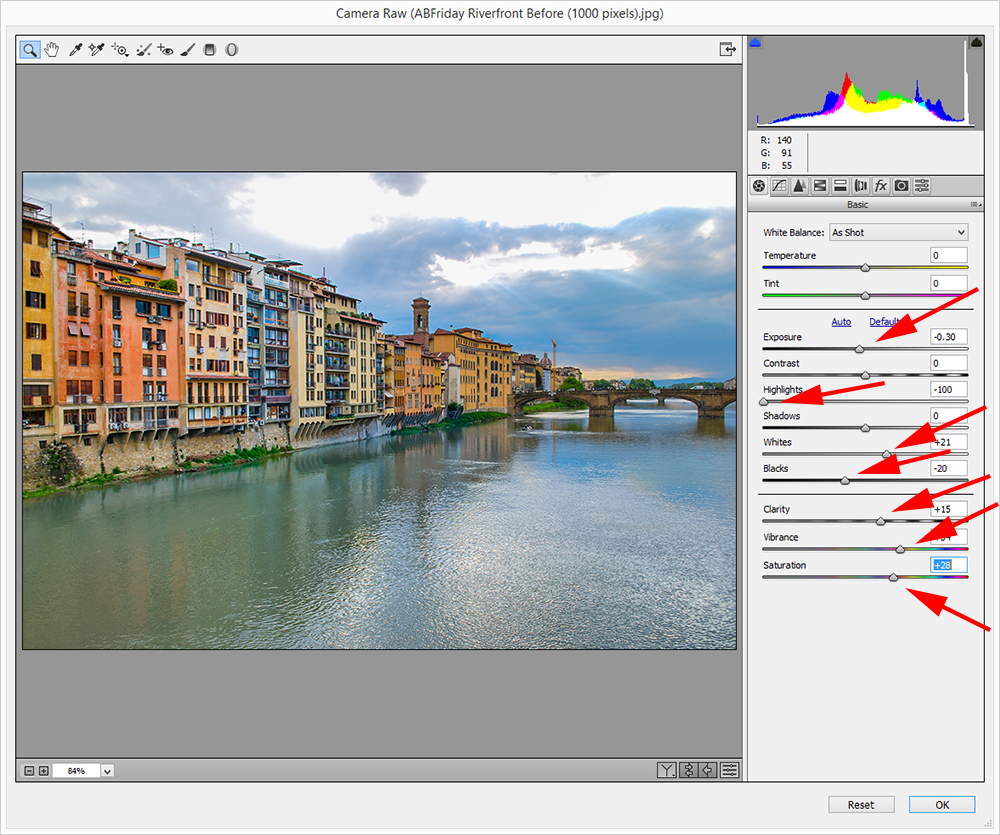 Adjustments in Camera Raw Filter, Basic Tab
These changes brought out the strong colors and enhanced the contrast of the scene. But more was needed to add some drama to the sky and the water in the foreground. Switching to the Gradient tab of the Camera Raw Filter, I moved the exposure slider to -1.7 (red arrow) and applied two gradients, one for the sky and one for the water (yellow arrows).
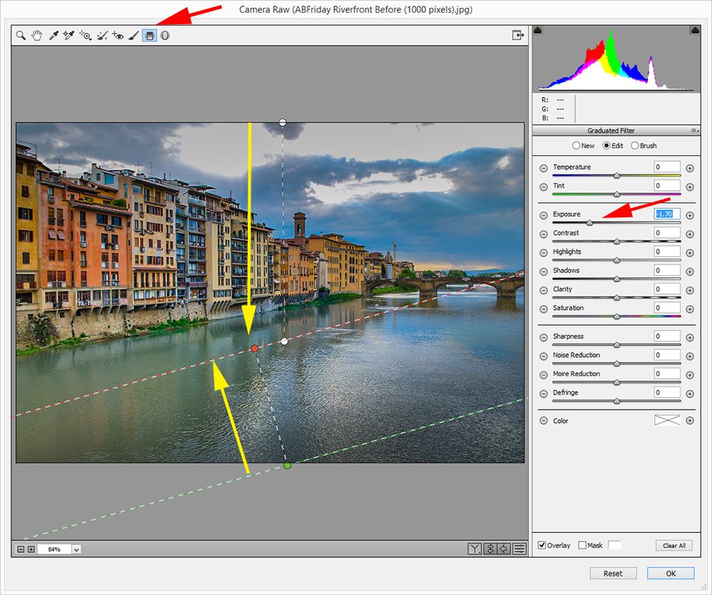
Note that the angle of the gradient for the water is parallel to the river’s edge. I clicked the OK button and the results of the steps so far are shown below. It is a nice image and I suspect pretty close to what Karen was seeing when she took the picture (but she will be the judge of that).
 Results of Camera Raw Filter Adjustments
At this point the image was ready to go through Door 2. I will admit up front that the process from here was one of enthusiastic experimentation because I intentionally chose an area of Photoshop that I had never visited before and a lot of rejects are lying on the virtual cutting room floor. To save you from a detailed description of the many dead ends I encountered let’s go straight to the series of steps that produced the final result.
So after a fair amount of time, I clicked Filter >Stylize>Extrude. The dialog box that appeared is shown in the screen capture below.
 The “Extrude” Process
The settings shown (red arrows) are those that I chose, not the default settings. This is a really cool tool, and different choices on these settings can produce radically different results. The final result is shown below.

Final Result
I liked what I saw here because it reminded me just a little of Cubism which set in motion the modern art movement of the early 20th century. I’ll be interested in what you think.
Don’t forget to see the other interpretations by the other participants. You can get to them by clicking here. I can’t wait to see them myself.

Pingback: The Afters! After-Before Friday Anniversary Challenge | Visual Venturing
An interesting approach Robin, it kind of reminds me of a impressionist painting. Glad you went through door 2 🙂
LikeLike
Thanks very much. Yes, there are some interesting things inside the room behind Door 2. I’ll have to make another visit there.
LikeLiked by 1 person
I like it a lot, especially that you edited it first in your usual style. It shows in the final image.
LikeLike
Thanks very much. I have been looking at what the others have done and the directions taken are quite varied. It has been a fun exercise.
LikeLike
Cool! What a difference.
LikeLike
Thanks! Certainly different from what I usually do.
LikeLike
I really like what you have done here, can you see yourself doing a series of images using this type of post processing?
LikeLike
I really like how you stepped us through your editing process. Wonderfully done. Wasn’t this such a fun experience with After and Before?
LikeLike
Thanks, Cee. I appreciate that. Yes, This has been totally fun. I haven’t made it to all the individual posts yet, but I have been so impressed by the diversity of creative ideas. I was particularly taken by yours with the two completely different results between a vertical and horizontal crop(plus the additional touches, of course).
LikeLike
Very cool. Thank you Robin.. I look forward to checking out the other images. 🙂
LikeLike
Thanks, Susan. I appreciate your stopping by and commenting. Yes, the others were very interesting.
LikeLiked by 1 person
When are you coming to NYC to shoot? Hint hint..,
LikeLike
Good question. I know I’ll be up there during the first week in May next year because of other business. But I was also thinking about mid-April to catch the cherry trees in Central Park. What with trips to South America and Antarctica in early 2015, it will be hard top get up there much before that.
LikeLike
My first inclination was to go to an extreme but I stifled it as much as possible. I’m glad you didn’t. I think it’s necessary to process the way you normally do before adding or exaggerating an effect. This works great because below it is a well processed image. I love what you did though I doubt I would ever use the effect. But as soon as I saw it I said to myself, “Yeah, I wish I had had the guts to go all the way! Great job.
LikeLike
Thanks, Emilio. Thanks for checking it out. I started sooner than normal–almost as soon as the image was announced, so I knew I had plenty of time to back off if nothing good was happening. Always good to have an emergency exit available, especially if no Plan B has been prepared;-)
LikeLike
I was tempted to apply a pastel or water colour effect to mine but held back. I like what you have done, it has a geometric feel as well as something like finger painting. Great work, I have never used the extrude filter will need to play with it now.
LikeLike
Thanks, Ben. I appreciate the comments. Your process gave me several new ideas as well. The extrude filter looks like an interesting little tool. First time for me too. I’ll plan to try it some more.
LikeLike
Robin,
Really enjoyed following this and loved your interpretation. Amazing how many ways one scene can be interpreted.
LikeLike
Thanks very much. Good to hear from you. Yes, I thought everyone had an interesting approach and I learned a bunch of things as well.
LikeLike
Robin this is inspired! It totally satisfies the artist’s thirst…and definitely a touch of cubism.
I just love everything about it… thanks so much for the tutes.. I definitely want to play with this tool.
I didn’t know it existed 🙂
A wonderful result!
LikeLiked by 1 person
Wow, thanks so much. Your comments made my day.
LikeLiked by 1 person
Truly a pleasure. I find it very inspiring 😊
LikeLiked by 1 person
Hi, Robin. Well, what a bad post hostess I’ve been on this, taking until today to comment on everyone’s submissions. But it’s fun to see them all again with a set of fresh eyes! First, I love what you said about having to go through door number one before experimenting through door number 2. I find there are no shortcuts when it comes to post-processing. Play as you will, if the image isn’t as strong enough as you feel you can make it with basic adjustments, the after effect will never be as strong.
The extrude filter seems similar to “detail extractor” in Nik Color Efex Pro (which is what I used for my monochrome image). It’s definitely fun to experiment, and like you, I had quite a few copies end up in my trash bin. So glad you went out on a limb – it was so un-Robinlike in its treatment, and that’s what makes it so much fun!
LikeLiked by 1 person
Thanks, Stacy. Great comments, as usual and thanks again for organizing the ABFriday Forum. It is developing into quite an interesting phenomenon.
LikeLike
Pingback: One Four Challenge – Nov wk 4 – Polls.. and December’s challenge | Captivate Me