One Photo Focus-Augsut 2016

One the first Friday of each month, Stacy Fischer’s AfterBefore Friday Forum invites all participants to work their magic on the same image–an image that is selected by one of the participants in advance.  Hence the title of the event is “One Photo Focus.”  It happens that this month I am the one supplying the image and I can’t wait to see what creative license is taken with it by the other participants.  Their creations can be found at Visual Venturing and I hope everyone will check them out.

Robin Kent 1PF August 2016 Original Raw Version)

Original Raw Image — Unprocessed

The original image (above) was taken during a recent trip to London.  I’m sure everyone recognizes the iconic London Eye, a 443-foot-high Ferris wheel, erected in 1999.  The building to the right is London County Hall which served as the city of London’s seat of government through most of the 20th century.  It now houses a variety of tourist attractions and an upscale hotel. The photo was taken from the Westminster Bridge and, if one looked 90 degrees to the left one would see an even more iconic scene, the buildings of Parliament and the grand tower with the famous clock known as Big Ben.

I decided to take the straight approach this time and stayed away from my favorite sandbox, AKA the Filter Gallery.  I followed my normal workflow by using Adobe Camera RAW (ACR) to set the black and white points, increase the clarity and vibrance a bit, and then opened it in Photoshop.  Once in Photoshop, the tilt of the big wheel was annoying so a slight adjustment with the Transform function (Edit->Transform) was used to fix the problem. There was also a smudge-like apparition in the clouds left of the wheel’s center that needed removal. These adjustments are shown in the image below.

Robin Kent 1PF August 2016 Color Version)

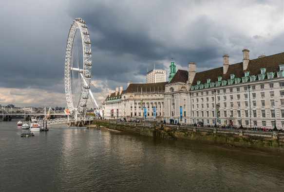
Image after ACR and Basic Clean-up in Photoshop

Thinking what to do for One PhotoFocus, I thought he dark clouds seemed to be the most dramatic feature.  One possibility that seemed promising was to take advantage of those clouds in a black and white photograph.  This was accomplished with an Adjustment Layer (Layer->New Adjustment Layer->Black and White.  The High Contrast Red Filter preset was used to further emphasize the clouds.Finally I used a mask and a curves adjustment layer to strengthen the contrast of the water and the right half of the building.  The final image is shown below.
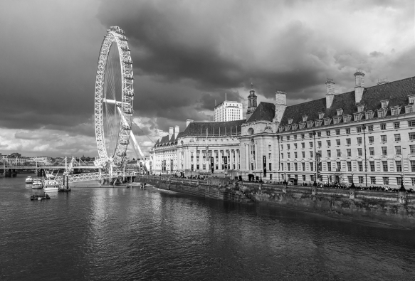
Robin Kent 1PF August 2016 BW Version)

Final Image

Thanks once again to Stacy Fischer for keeping our merry band of post processors on track.  Please visit her site at Visual Venturing to see the creative imaginations of the other participants.

OnePhoto Focus–May 2015

Those of us who participate in the AFterBefore Friday Forum have full control over our destiny every week of the month—except the first week.  On this week, iInstead of choosing anything we want from our own images, we have the “opportunity” to work on a single image selected for us.  As the day approaches when the “Chosen One” is to be unveiled, this participant at least, has flashbacks to those days just before his final exams.  The eternal question: “What will be on the test?” looms ahead.

This week’s image was graciously provided by  Shane Francescut and when I saw it, I was speechless.  Well, not really, but I digress.  Let’s look at the image.

2015 05 01 PhotoFocus Before

Original Image

After some thinking, I thought I would take a different tack from last month when I subjected the provided image to a lengthy sequence of exotic Photoshop devices that caused formal protests from the ACLU, Human Rights Watch, and Green Peace.  This time it would be a quick and merciful coup de grace.  Or, in a nod to the theme of OnePhoto Focus, it would be done with “OnePhotoshop Tool.”

But I cheated.  I had the RAW version of Shane’s image and made the standard exposure adjustments in Adobe Camera that I make with almost every image.  The result and ACR settings are shown just below.

2015 05 01 PhotoFocus Before 02

Results of ACR Process

ACR Settings: Highlights: -100; Shadows: +100; Whites: +47; Blacks: -8; Clarity: +30; Vibrance: +30

Then, I opened an Adjustment Layer–>Curves (Blend Mode=Difference) and chose the Negative Preset. (Blue arrow in screen shot below). This has the effect of completely reversing the tonal distribution of the image.

2015 05 01 PhotoFocus Before 01A

Next, I set an anchor point on the diagonal line through the histogram and dragged the point left and down (red arrow).   The Preset Panel now reads “Custom” indicating I have made a change to the Preset previously chosen. The result is show below.

2015 05 01 PhotoFocus After

Fiunal Result

That’s it.  I kind of like it.  Anyway, it didn’t take long –Less than 2 minutes, counting the ACR steps.

Any thoughts, comments, or suggestions are appreciated.  But be sure to zip over to Visual Venturing to see what everyone else did.

OnePhotoFocus-March 6, 2015

Today marks the unveiling of the third One Photo Focus Forum (say that 3 times fast), in which once a month, a volunteer army of photo-processing practitioners provides a wide range of interpretations of the same image.   Stacy Fischer, who has already demonstrated her extraordinary skill in herding cats with the AfterBefore Friday Forum, has stepped up to the next level of difficulty, known as loading frogs into a wheelbarrow. In doing so, she has gathered all of the interpretations into a single place for your viewing pleasure.  To see them all, click on her wheelbarrow.

OLYMPUS DIGITAL CAMERA

Original Image by Loré Dombaj

This week’s image (shown above) was submitted by Loré Dombaj and I must admit I was impressed by the challenge facing me.  Which is a nice way of saying I had no idea what to do.  So, I applied a common problem solving technique known as procrastination.  The Theory of Procrastination holds that the pressure of a short deadline will unleash one’s deeply buried creative power.

That didn’t work either.  But here are the steps I took, all in Photoshop CC.  First, I applied Robert Capa’s advice of getting closer and cropped off the top part of the image to concentrate on the section that was most interesting to me (image below). That one step changed the image from one that I liked to one that I liked a lot.  All of a sudden, the image is dominated by a tightly composed scene with a repeating circular pattern.  Plus, the dappled highlights are placed so perfectly that one is reminded of a painter who chooses where the light will be. The charming cherub is now rightfully the center of attention.

OLYMPUS DIGITAL CAMERA

The principal objects in the photo (tables, cherub, and flower pot) all have a weathered, timeworn appearance that begged to be emphasized.  I called up the Filter Gallery and selected “Poster Edges.”  The screen capture is shown below. I adjusted the 3 sliders (red arrow) until I found the combination I liked and clicked OK.

2015 03 1 PhotoFocus Before 03

Photoshop CC Filter Gallery–Poster Edges

OLYMPUS DIGITAL CAMERAResult of Poster Edges Adjustment

The image was looking good, but it lacked warmth (see above).  A naked cherub wouldn’t be smiling if it was a cold day.  We should improve his mood with a Hue/Saturation Adjustment Layer.  I set the Saturation to +60 (red arrow) and left the blend mode at normal (yellow arrow).

2015 03 1 PhotoFocus Before 05A

Photoshop CC Hue/Saturation Layer

Insert After Final Image

The Final Image below includes the use of an Unsharp Mask with the settings as follows: Amount: 131%, Threshold: 1.1 pixels, Pixels: 0. I found that a small change in either of the first two sliders made an important difference, although it is very hard to see at this size.  In fact, the small size displayed here doesn’t do justice to the image; a lot of the subtlety captured by Loré disappears.

OLYMPUS DIGITAL CAMERA

Voila!

Final observations:  It turns out that the results of the Filter Gallery steps will be quite different depending on the size of the image.  The first time, I used the filter gallery before downsizing the image to 1,000 pixels wide and that is what you are seeing here.  An experimental repeat with the image downsized to 1,000 before the application of the Poster Edges brought a different result, one that I felt was too coarse and not nearly as attractive.  This is an excellent example of why Workflow (the specific sequence of post-processing actions) is important.  The same actions, implemented in a different sequence, can produce different results.

At any rate, check out the other interpretations of this image at Stacy’s Visual Venturing site.

ABFriday Week 31- One Photo Focus

Week 31 After-Before (double)

                     After Image                                                    Before Image

The almost-famous ABFriday Forum begins the year 2015 with a special new feature, entitled “One Photo Focus.”  Here’s how it works: one week each month, all participants will impose their skills and if need be, their trickery on the same image.  The images for the next several months have already been submitted by the early adopters who have already signed up for this extravaganza.  The honor of  being the first in 2015 goes to Emilio Pasquale and he has presented us with an interesting challenge.  I  thought at first it was taken on the set for the chicken race scene in the movie “Rebel Without a Cause.”   I can’t wait to see what other interpretations will be unveiled today which can be found here.  Like all ABFriday posts, anyone can participate.  Guidelines can be found at Stacy Fischer’s Visual Venturing site.

Robin Kent Week 31 Before

 Emilio’s Original Challenge Image

Looking at the challenge image I could see (after the movie flashback) that it was quite dark (despite some strong shadows) and it lacked overall sharpness. This is not necessarily bad, but it does affect the directions one can choose in creating something that hopefully will have an impact.  And I suspect that Emilio didn’t want to make it too easy.  Anyway, it seemed that moving away from a photographic look toward a painterly style might be worthwhile.  In doing so, I learned that there is a dark side to Photoshop CC.

But I am getting ahead of myself.  The first step was to follow my normal workflow and run the original image through the RAW (ACR) process, adjusting contrast, tonality, and brightness.  The result is shown in the image below which evokes a sunny day that seemed consistent with the strong shadows in the original. The adjustments (some of

Week 31 Before 01

ACR Adjustments

them rather extreme) were intended to cut back on the bright highlights and open up the dark areas for greater detail.

Step 2 was to open the image in Photoshop and after routine and very minor clean-up, the Unsharp Filter was unleashed just to see what might happen.  The sharpness didn’t improve, but as the setting got more extreme, the image got more interesting (i.e., less photographic). The screen capture below shows the settings and the effect.

Week 31 Before 03

Unsharp Filter Applied

I’ve not done a lot of special effects work on images, but recently have been experimenting with the Filter Gallery in Photoshop.  So that seemed like a good place to start and I was pleasantly surprised to find an “Oil Paint” function in the drop-down menu under Filter (Filter–>Oil Paint).  What I did not know at the time was that I had accidentally opened Photoshop CS6  instead of the latest version of Photoshop CC.  So be aware that the following steps are not possible unless you have a copy of Photoshop CS6 or CS5. More on this later.

Like the Filter Gallery, the Oil Paint function opens the image in a full screen dialog window with the adjustment controls on the right side.  The screen capture shows the settings and a detail section of the effect.

SWeek 31 Before 04

Settings for Oil Paint Filter in Photoshop CS6

Week 31 Before 05

Image After Using the Oil Paint Filter

Just for fun,I took the idea one step farther, and used a black and white adjustment layer choosing the High Contrast Red Filter effect instead of the default option. The final image is shown below.  Immediately below the full image is a detail of a section of the image to show a little more clearly the effects of the Oil Paint Filter.  I would be interested in your thoughts on the color vs. the black and white versions.

Week 31 After FinalFinal Image

Week 31 After 01 Detail

Thanks again to Emilio Pasquale for his contribution to the First Edition of One Photo Focus.  And thanks to Stacy Fischer for organizing this project. To see what the others have done with Emilio’s image, please check out the Visual Venturing post at this location. And if the raging online controversy over Adobe’s removal of the oil paint filter piques your interest, just Google “Where is the Oil Paint Filter in Photoshop CC?”